
Adding images is an easy way to bring your application to life. This article tackles the most common issues encountered when adding images to your Flutter application. For each question, we will walk through a possible solution and the UI generated by the implementation of that code.
How do I retrieve an image from the web?
To display an image obtained over a network, all you need is the Image.network widget. The first argument it takes is the src (the url link to your image).
class _MyHomePageState extends State<MyHomePage> {
  final String myImageUrl =
      "https://images.unsplash.com/photo-1485841890310-6a055c88698a?ixlib=rb-1.2.1&ixid=eyJhcHBfaWQiOjEyMDd9&auto=format&fit=crop&w=1350&q=80"; // <- defines the url path of our image

  @override
  Widget build(BuildContext context) {
    return Scaffold(
      backgroundColor: Colors.black,
      body: Container(
        color: Colors.white,
        child: Center(
          child: Image.network(
              myImageUrl), // We pass int the url of our image here.
        ),
      ),
    );
  }
}
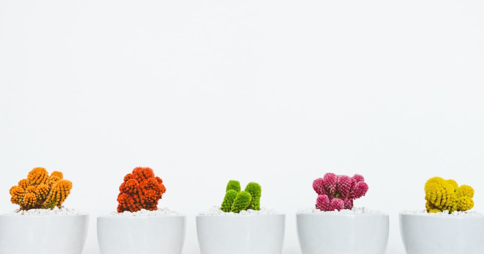
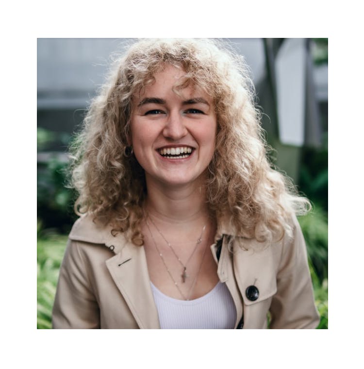
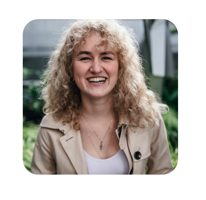
However, It is possible for your image not to load. To cover this scenario, we use an errorBuilder .
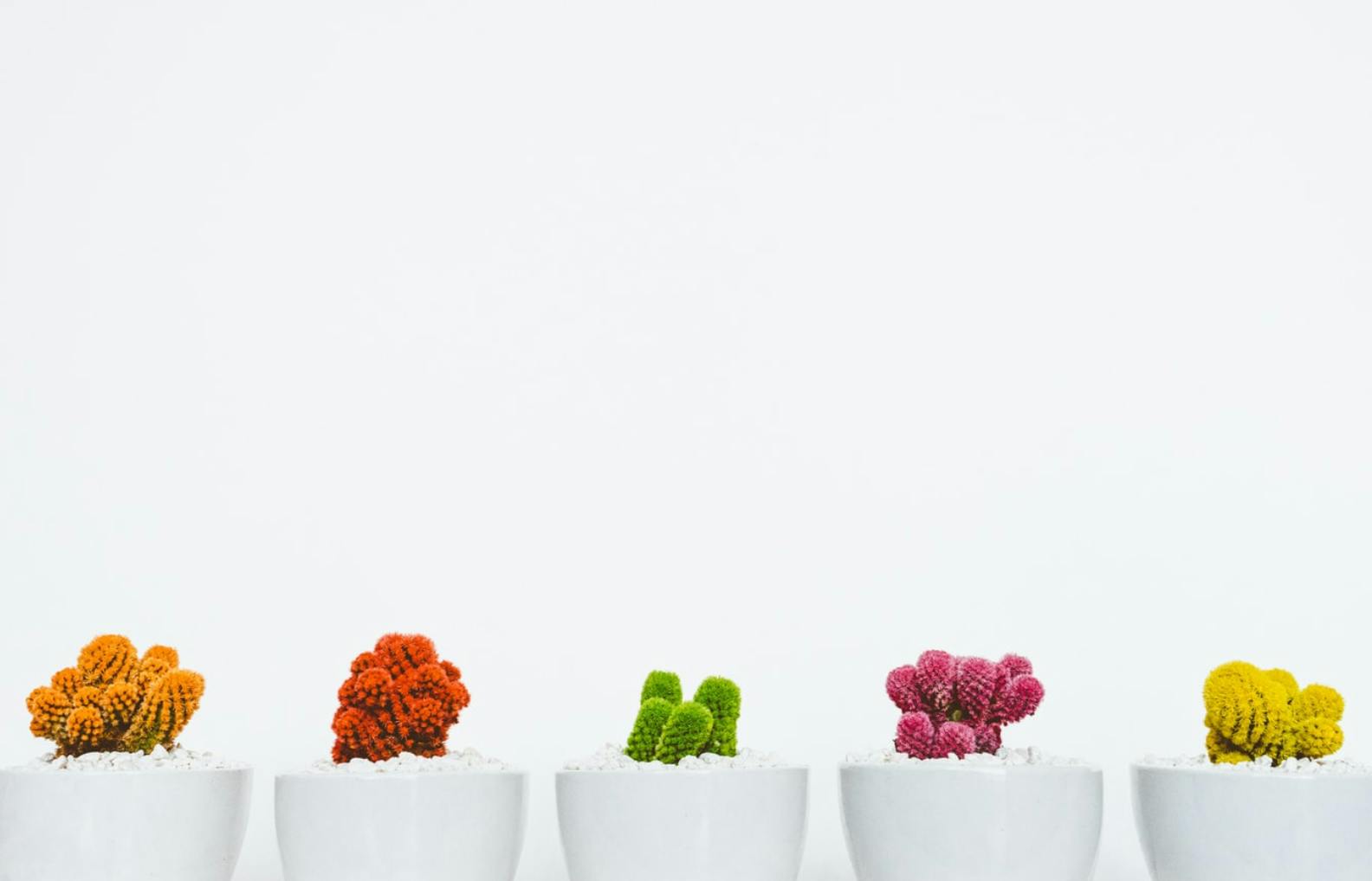
 When our image fails to load, we show the second image rather than a blank screen.
As shown below, the errorBuilder provides us with our error’s stack trace and an ability to handle exceptions in whatever way we want. In our code below, however, we are only returning a text widget to inform the user of the issue.
Another solution is to instead return an asset stored locally in your application.
class _MyHomePageState extends State<MyHomePage> {
  final String myImageUrl =
      "https://images.unsplash.com/photo-1485841890310-6a055c88698a?ixlib=rb-1.2.1&ixid=eyJhcHBfaWQiOjEyMDd9&auto=format&fit=crop&w=1350&q=80"; // <- defines the url path of our image

  @override
  Widget build(BuildContext context) {
    return Scaffold(
      backgroundColor: Colors.black,
      body: Container(
        color: Colors.red,
        child: Center(
          child: Image.network(myImageUrl,
              semanticLabel: "This is an image of a row of plants", // <- A description of the image for voice  applications.
              errorBuilder: (BuildContext context, Object exception,
                  StackTrace stackTrace) {
            return Text(
              'Sorry, cannot load image', // <- What we show when image fails to load
              style: TextStyle(color: Colors.white, fontSize: 30),  // <- Styling for default text
            );
          }),
        ),
      ),
    );
  }
}
Also, I believe it’s important to make our UI’s inclusive — to cater to those who perhaps have difficulty seeing. Hence, we use the semantic label, on line 14, to allow systems like android’s Talkback and iOS’ Voiceover to provide a description of what the image is.
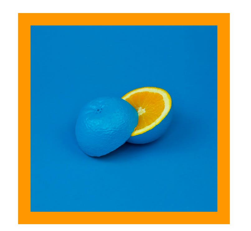
How do I add a filter to an image?

 Before and After the filter
We apply a colour filter using the ColorFiltered widget. This widget requires a value for ColorFilter — the instance used to paint the object. The ColorFilter can be constructed in different ways:
ColorFilter.mode(Color colour, BlendMode blendMode)— creates a filter using a source colour and a given blend mode.ColorFilter.matrix(List<double> matrix)— transforms a color using a 5 x 5 matrix.ColorFilter.linearToSrgbGamma()— it applies the sRGB gamma curve to the RGB channels.
In our example below, we have created a greyscale filter using saturating our image with a base colour of grey.
class _MyHomePageState extends State<MyHomePage> {
  final String myImageUrl =
      "https://images.unsplash.com/photo-1485841890310-6a055c88698a?ixlib=rb-1.2.1&ixid=eyJhcHBfaWQiOjEyMDd9&auto=format&fit=crop&w=1350&q=80"; // <- defines the url path of our image

  @override
  Widget build(BuildContext context) {
    return Scaffold(
      backgroundColor: Colors.black,
      body: Container(
        color: Colors.red,
        child: ColorFiltered(   // <- wrap yor image with a Color Filtered widget
          colorFilter: ColorFilter.mode(Colors.grey, BlendMode.saturation), <-  // Our grey filter
          child: Center(
            child: Image.network(myImageUrl),
          ),
        ),
      ),
    );
  }
}
How do I use an image asset?
Using an image asset is pretty straight forward. Just follow these steps:
Have the image downloaded on your computer.Add the image to your project
The best way is to create an images folder in the root of your project and include the image in the folder.
Add the image path to your pubspec.yaml
  # To add assets to your application, add an assets section, like this:
  assets:
     - images/building.jpeg
It is important to ensure your code is properly indented, or you might face some issues. After adding the image, run flutter pub get .
4.Lastly, use the image in your code
class _MyHomePageState extends State<MyHomePage> {
  final String myImageUrl =
      "https://images.unsplash.com/photo-1485841890310-6a055c88698a?ixlib=rb-1.2.1&ixid=eyJhcHBfaWQiOjEyMDd9&auto=format&fit=crop&w=1350&q=80"; // <- defines the url path of our image

  @override
  Widget build(BuildContext context) {
    return Scaffold(
      backgroundColor: Colors.white,
      body: Container(
        child: Center(
          child: Image.asset('images/building.jpeg'),  // <- we use the Image.asset to retrieve the asset
        ),
      ),
    );
  }
}
We useImage.asset and pass it the path to the asset.
How do I make a grid of images?
 This is what we will create.
Making a grid of images is pretty simple with Flutter.
To use Flutter’s GridView, we must have a list of images we wish to show. In our code below, we have defined a list of urls for the images you see above.
class _MyHomePageState extends State<MyHomePage> {
  List<String> imageList = [
    'https://images.unsplash.com/photo-1523554888454-84137e72c3ce?ixlib=rb-1.2.1&ixid=eyJhcHBfaWQiOjEyMDd9&auto=format&fit=crop&w=500&q=60',
    'https://images.unsplash.com/photo-1569172122301-bc5008bc09c5?ixlib=rb-1.2.1&ixid=eyJhcHBfaWQiOjEyMDd9&auto=format&fit=crop&w=500&q=60',
    'https://images.unsplash.com/flagged/photo-1572392640988-ba48d1a74457?ixlib=rb-1.2.1&auto=format&fit=crop&w=500&q=60',
    'https://images.unsplash.com/photo-1589030343991-69ea1433b941?ixlib=rb-1.2.1&ixid=eyJhcHBfaWQiOjEyMDd9&auto=format&fit=crop&w=500&q=60',
    'https://images.unsplash.com/photo-1561214115-f2f134cc4912?ixlib=rb-1.2.1&ixid=eyJhcHBfaWQiOjEyMDd9&auto=format&fit=crop&w=500&q=60',
    'https://images.unsplash.com/photo-1555443805-658637491dd4?ixlib=rb-1.2.1&ixid=eyJhcHBfaWQiOjEyMDd9&auto=format&fit=crop&w=500&q=60',
    'https://images.unsplash.com/photo-1572450732467-5eb1311e7bc8?ixlib=rb-1.2.1&ixid=eyJhcHBfaWQiOjEyMDd9&auto=format&fit=crop&w=1267&q=80',
    'https://images.unsplash.com/photo-1523554888454-84137e72c3ce?ixlib=rb-1.2.1&ixid=eyJhcHBfaWQiOjEyMDd9&auto=format&fit=crop&w=500&q=60',
    'https://images.unsplash.com/photo-1569172122301-bc5008bc09c5?ixlib=rb-1.2.1&ixid=eyJhcHBfaWQiOjEyMDd9&auto=format&fit=crop&w=500&q=60',
    'https://images.unsplash.com/flagged/photo-1572392640988-ba48d1a74457?ixlib=rb-1.2.1&auto=format&fit=crop&w=500&q=60',
    'https://images.unsplash.com/photo-1589030343991-69ea1433b941?ixlib=rb-1.2.1&ixid=eyJhcHBfaWQiOjEyMDd9&auto=format&fit=crop&w=500&q=60',
    'https://images.unsplash.com/photo-1561214115-f2f134cc4912?ixlib=rb-1.2.1&ixid=eyJhcHBfaWQiOjEyMDd9&auto=format&fit=crop&w=500&q=60',
    'https://images.unsplash.com/photo-1555443805-658637491dd4?ixlib=rb-1.2.1&ixid=eyJhcHBfaWQiOjEyMDd9&auto=format&fit=crop&w=500&q=60',
  ];

  @override
  void initState() {
    SystemChrome.setEnabledSystemUIOverlays([]); // <- makes app full screen
    super.initState();
  }

  @override
  Widget build(BuildContext context) {
    return new Scaffold(
      backgroundColor: Colors.black,
      appBar: PreferredSize(  // <- responsible for creating the app bar you see above
        preferredSize: Size.fromHeight(100),
        child: Column(
          mainAxisAlignment: MainAxisAlignment.center,
          children: [
            new Text(
              widget.title,
              style: TextStyle(
                  fontFamily: 'Vogue',  // <- custom font
                  color: Colors.white,
                  fontSize: 30,
                  letterSpacing: 8),
            ),
          ],
        ),
      ),
      body: SingleChildScrollView(
        child: new Column(children: [
          new GridView.count(
            crossAxisCount: 2,
            controller: new ScrollController(keepScrollOffset: false),
            shrinkWrap: true,
            scrollDirection: Axis.vertical,
            children: imageList.map((String url) {
              return _singleImagePreview(url);
            }).toList(),
          ),
        ]),
      ),
    );
  }

  Widget _singleImagePreview(String imageUrl) {
    return new Container(
      height: 100.0,
      margin: new EdgeInsets.all(1.0),
      child: Image.network(imageUrl, fit: BoxFit.cover),
    );
  }
}
Next, we need to create the single grid for each image. This is captured on lines 60 to 65, where each grid is a container containing an image. Here, we simply have to pass in an imageUrl to the method.
The next concrete step is creating the grid. We use GridView to do so. On line 47, we state that we want to create a grid with only 2 columns. On line 51, we iterate through out list of urls and call the _singleImagePreview method for each one to insert it into the grid. We also add the SingleChildScrollView and the controller on line 48 to allow us to scroll down the grid.
How do I round the corners of an image?
 Before and After using ClipRRect
There are multiple ways of rounding the corner of an image. One of the options is to use a ClipRRect . ClipRRect allows you specify a borderRadius . BorderRadius has multiple constructors to achieve different results. For example:
BorderRadius.circular— Rounds all the cornersBorderRadius.vertical— Rounds the top and bottom cornersBorderRadius.horizontal—Rounds the left and right cornersBorderRadius.only—Rounds the corners of the sides you specify.
class _MyHomePageState extends State<MyHomePage> {
  String imageSource =
      'https://images.unsplash.com/photo-1592275772614-ec71b19e326f?ixlib=rb-1.2.1&ixid=eyJhcHBfaWQiOjEyMDd9&auto=format&fit=crop&w=634&q=80';


  @override
  Widget build(BuildContext context) {
    return new Scaffold(
      backgroundColor: Colors.white,
      body: Center(
        child: ClipRRect(
          borderRadius: BorderRadius.circular(30.0),
          child: Image.network(
            imageSource,
            width: 300,
            height: 300,
            fit: BoxFit.cover,
          ),
        ),
      ),
    );
  }
}
Another approach to this could be to use a Container widget. The Container may be used to provide more flexibility — when you wish to do more than simply rounding the corners. This may include adding a visible border, box shadow, gradient or background colour to the image.This will be touched on later in the article.
How do I make my images circular?
 Before and After Clip Oval
Wanting circular images is quite common. Especially, when creating profile picture images. It is easy to achieve this using the ClipOval widget to create an oval-shaped clip of the child element.
class _MyHomePageState extends State<MyHomePage> {
  String imageSource =
      'https://images.unsplash.com/photo-1492633423870-43d1cd2775eb?ixlib=rb-1.2.1&ixid=eyJhcHBfaWQiOjEyMDd9&auto=format&fit=crop&w=1350&q=80';


  @override
  Widget build(BuildContext context) {
    return new Scaffold(
      backgroundColor: Colors.blueGrey,
      body: Center(
        child: ClipOval(   // <- Where the magic happens
          child: Image.network(
            imageSource,
            width: 300,
            height: 300,
            fit: BoxFit.cover,
          ),
        ),
      ),
    );
  }
}
How do I give an image a border?
 Orange border created using BoxDecoration
Giving an image is quite straightforward. As previously mentioned, another approach to dealing with borders is to use the Container widget.We wrap our image widget in a Container and decorate this with a BoxDecoration. We can then specify the BoxBorder as shown in line 12.
class _MyHomePageState extends State<MyHomePage> {
  String imageSource =
      'https://images.unsplash.com/photo-1494253109108-2e30c049369b?ixlib=rb-1.2.1&ixid=eyJhcHBfaWQiOjEyMDd9&auto=format&fit=crop&w=1350&q=80';

  @override
  Widget build(BuildContext context) {
    return new Scaffold(
      backgroundColor: Colors.white,
      body: Center(
        child: Container(
          decoration: BoxDecoration(
            border: Border.all(
              color: Colors.orange,
              width: 20,
            ),
          ),
          child: Image.network(
            imageSource,
            width: 300,
            height: 300,
            fit: BoxFit.cover,
          ),
        ),
      ),
    );
  }
}
However, if your container child element is not rectangular, you can use the ShapeDecoration class to draw a ShapeBorder. It is also the better choice if you wish to animate your image to transition from a circle to a rectangle (or vice versa).
How do I place my images on top of one another?
Placing texts over images can be useful way to enrich your application’s visual. To explain how this can be used, we can generate the UI below.
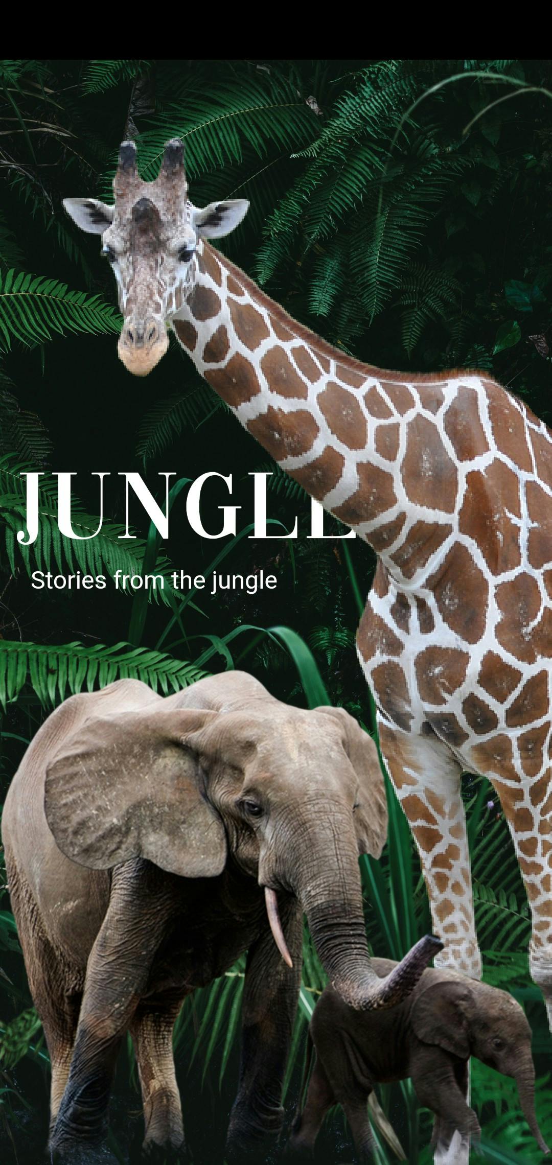 UI created with 3 overlapping images and 2 texts.
To achieve this, we use the Stack widget to place images over one another. With the Stack widget, we can use the Positioned widget to decide where our images and texts are placed on the screen. It takes a double value for left, right, top and bottom — this is the distance that the child’s edge is inset from the selected side of the stack.
class _MyHomePageState extends State<MyHomePage> {
  String jungleImage =
      "https://images.unsplash.com/photo-1588842785101-e6179be70d49?ixlib=rb-1.2.1&ixid=eyJhcHBfaWQiOjEyMDd9&auto=format";

  @override
  void initState() {
    SystemChrome.setEnabledSystemUIOverlays([]);
    super.initState();
  }

  @override
  Widget build(BuildContext context) {
    return Scaffold(
      backgroundColor: Colors.black,
      body: Stack(
        children: [
          Image.network(. // <- our jungle background
            jungleImage,
            width: MediaQuery.of(context).size.width,
            height: MediaQuery.of(context).size.height,
            fit: BoxFit.cover,
          ),
          Positioned(  // <- Our Jungle text
              top: 260,
              child: Padding(
                padding: const EdgeInsets.all(8.0),
                child: Text(
                  'JUNGLE',
                  style: TextStyle(
                      color: Colors.white,
                      fontSize: 80,
                      fontFamily: 'Vogue',
                      letterSpacing: 3),
                ),
              )),
          Positioned( // <- Our sub text
              top: 310,
              child: Padding(
                padding: const EdgeInsets.all(20.0),
                child: Text(
                  'Stories from the jungle',
                  style: TextStyle(
                      color: Colors.white,
                      fontSize: 20,
                      fontFamily: 'Roboto'),
                ),
              )),
          Positioned( // <- the giraffe image
            top: 50,
            left: 40,
            child: Image.asset(
              'images/giraffe.png',
              fit: BoxFit.fill,
            ),
          ),
          Positioned(  // <- the elephant image
            bottom: 0,
            child: Image.asset(
              'images/elephant.png',
              width: MediaQuery.of(context).size.width,
              fit: BoxFit.fitWidth,
            ),
          )
        ],
      ),
    );
  }
}
It’s important to note that the order of the Stack’s children matters. It determines the order in which the widgets are being painted. The first child is painted on the screen, and the last widget is plastered last.
The end.
If you found this article helpful, consider tapping the 👏 button and giving a few claps! Follow me for more Flutter articles and leave any feedback or comments below!